Google, provider of a search engine, video hosting platform (YouTube), and news aggregator, makes its money from advertising, but how do advertisers know where to spend that money? Google collects data on the searches performed by its users, among other methods. Unlike Google Analytics, which shows advertisers their return on investment, Google Trends provides data on search terms for Search Engine Optimization. Although developed as a marketing tool, Google Trends offers free online data that the public can use to pry into the search habits of its users on a large scale, i.e., “big data.”
Google Trends is a general-interest tool, not to the standards of scholarly scientific research, but it can be useful to researchers and librarians for several purposes:
- For collection management, to know which topics may be more or less useful in the collection.
- To assess the usefulness of potential new subject headings or authority records.
- For search engine optimization, to select tags or text to enhance discoverability.
- To assist researchers who want to select a topic that will be of interest beyond academia.
- As a reference tool to discover related search terms that could enhance keyword searching.
Its value as a reference tool is limited due to the short period of time covered, but many questions about public taste and interest lend themselves to this tool. Google does not amass all data, but rather samples search queries, both current and historical. (Support page, https://support.google.com/trends/answer/4365533?hl=en accessed 1/6/2020) Like other sources of big data, raw numbers are too large to be meaningful without manipulation.
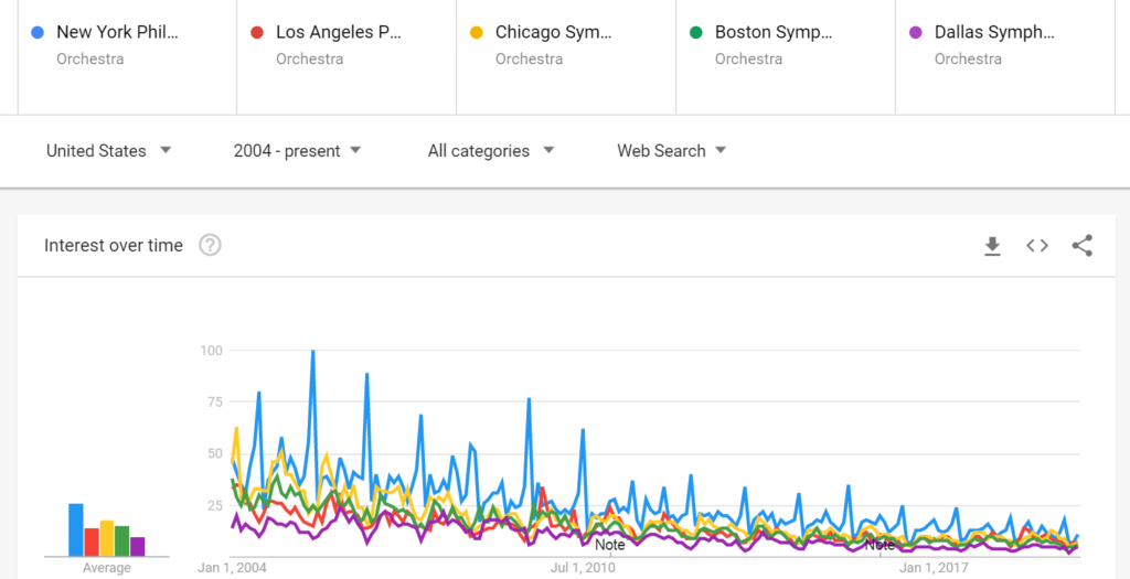
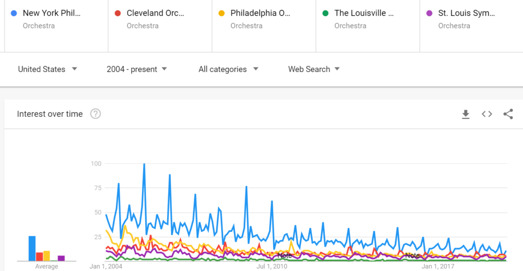
For example, interest in symphony orchestras can serve as a barometer for public interest in classical music. Google Trends delivers graphic representations of data over time (which can be specified in the search) and by “subregion” (for worldwide data) or state (for United States data). Example 1 shows the results of a comparison of searches for several orchestras with full seasons of concerts and extensive recording contracts: New York Philharmonic (blue), Los Angeles Philharmonic (red), the Chicago Symphony Orchestra (yellow), the Boston Symphony Orchestra (green), and the Dallas Symphony Orchestra (purple). All of these searches are “topic” searches according to Google’s methodology. These are curated terms that function like Library of Congress Subject headings. “Search terms” are keyword searches which generally yield fewer results when there is an available topic. Google displays a caveat when a comparison includes both “topics” and “search terms.”
The New York Philharmonic is the most-searched of the five, though interest has declined to a level relatively equal to the others:
Example 1
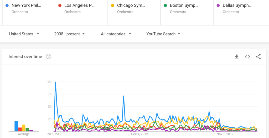
Switching from “Web Search” to “YouTube Search” automatically changes the beginning date to January 1, 2008 because Google has no data from before that date. (Example 1a)
Example 1a
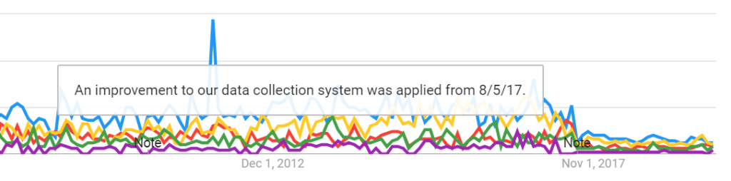
Mousing over the barely-visible word, “Note,” over “Nov 1, 2017” shows that “An improvement to our data collection system was applied from 8/5/17.” (Example 1c) A support page indicates that Google makes adjustments to data, but does not indicate what change was applied in 2017. In this case it seems to have reduced the number of results for all searches.
Example 1b
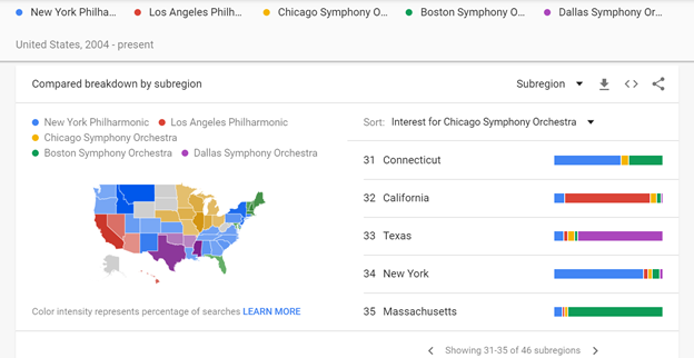
A map shows the relative frequency by “subregion,” which is the state level in the case of the United States. Google Trends adjusts regional data according to search volume, so it’s not a one-for-one comparison:
Google Trends normalizes search data to make comparisons between terms easier. Search results are normalized to the time and location of a query by the following process:
- Each data point is divided by the total searches of the geography and time range it represents to compare relative popularity. Otherwise, places with the most search volume would always be ranked highest.
- The resulting numbers are then scaled on a range of 0 to 100 based on a topic’s proportion to all searches on all topics.
- Different regions that show the same search interest for a term don’t always have the same total search volumes.
https://support.google.com/trends/answer/4365533?hl=en
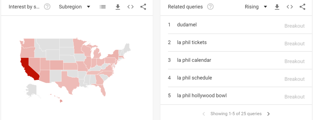
Color coding shows the orchestra with the most interest, and the highest level of interest is indicated by the deepest saturation on the map. Predictably, the home state is the most deeply saturated for each orchestra. To the right, the user can sort by interest level for any of the five search terms, and a bar chart shows the relative distribution of interest for each state. The second-most searched orchestra in New York was the Boston Symphony Orchestra, and the second-most searched orchestra in Massachusetts was the New York Philharmonic. Connecticut, wedged between the two states, shows that searchers are more divided between the two.
Example 2
Below this map, a series of maps shows relative interest for each search alone, again with higher saturation representing more interest. For these maps, the right side shows a list of related queries. In the case of the Los Angeles Philharmonic (Example 3), related queries include its conductor, Gustavo Dudamel, and information about concerts:
Example 3
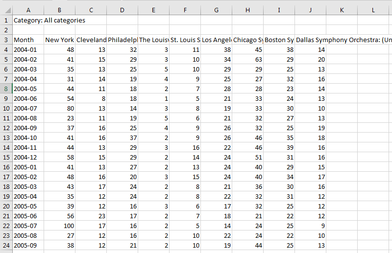
Google Trends limits comparisons to five terms or topics, but there is a workaround for adding comparisons. The results can be downloaded as a .csv file, so a researcher can use a common search term as a common denominator to merge multiple searches to capture more terms. Example 4 shows the New York Philharmonic compared to four different orchestras for the same period:
Example 4
Even if the New York Philharmonic were not once again topping the chart at “100” for both sets of comparison, downloading this data as .csv file allows for further analysis using Microsoft Excel or other software to combine the two data sets. This capability makes possible alternate graphic displays as well. To create the table in Example 5, I downloaded the values from the first search, then copied the downloaded values from the second search to the first spreadsheet, and deleted one iteration of the New York Philharmonic results. The spreadsheet adds granularity to the information as well:
Example 5
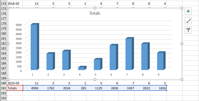
I totaled the results, then used this data to create a simple bar chart (Example 5a):
Example 5a
A drawback to Google Trends is that data visualization works well only when the results are within a relatively narrow range. When comparing searches for the New York Philharmonic with searches for other American orchestras, the resulting graph is illustrative, but when there is a wide disparity of interest, temporal representation of changes for a lesser-searched term disappear.
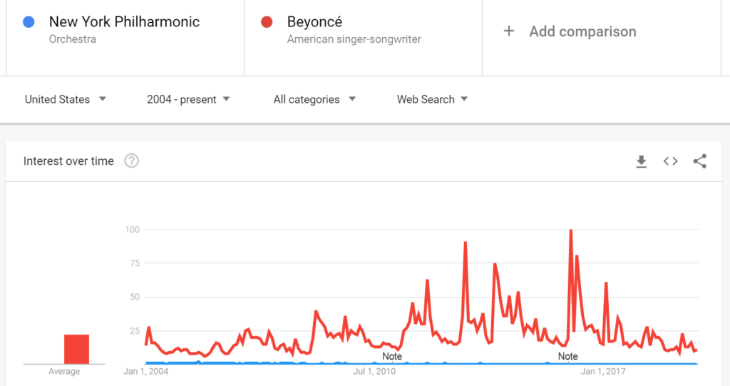
Example 6 shows that when comparing the New York Philharmonic to Beyoncé, one of the most popular mass-market musical artists in the world, the searches for the New York Philharmonic are reduced to a relatively flat line at the bottom of the graph:
Example 6
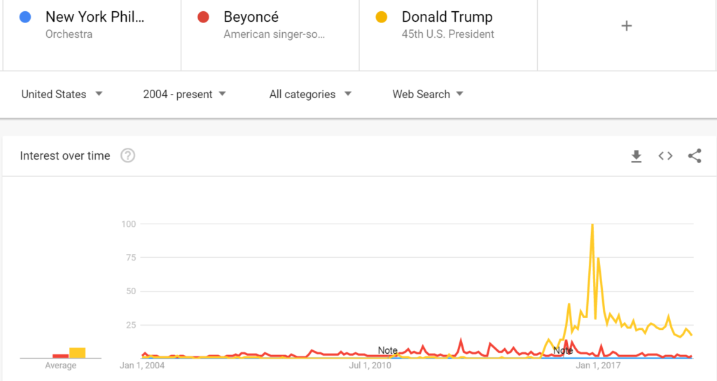
Example 6a, shows that searches for President Donald Trump dwarf both the orchestra and the singer:
Example 6a
Google Trends is a general-interest tool, not to the standards of scholarly scientific research, but it can be useful to researchers and librarians for several purposes:
- For collection management, to know which topics may be more or less useful in the collection
- To assess the usefulness of potential new subject headings or authority records
- For search engine optimization, to select tags or text to enhance discoverability
- To assist researchers who want to select a topic that will be of interest beyond academia
- As a reference tool to discover related search terms that could enhance keyword searching
I have already found it useful as a collection management tool:
- In 2016, having purchased a selection of K-Pop CDs and books due to local interest, I wanted to see if interest was waning. (It wasn’t)
- When choosing between TAB (tablature) and notated versions of guitar music, I discovered that interest in TAB is waning but notation is not.
- When deciding whether to purchase more ukulele music and less guitar music, I searched separately for trends in YouTube, Shopping, and general web searching. I learned that guitar interest is declining and ukulele interest is rising. And indeed, all the ukulele scores I purchased have circulated, some during the first week they were available!
- After the death of an important composer, I wondered whether I would need to buy more or fewer scores of his works. Comparing results for composers from five different countries who had died in recent years, I discovered that there is a spike in interest only in their own countries and only for a short time after their deaths. I decided against ordering additional scores for these composers.
Google’s data sets will only grow over time, making it a richer source of information with additional uses. In ten years my five deceased composers may indeed discover posthumous popularity, and if TAB experiences a rebirth of interest in Indiana, I will consider ordering more guitar music in TAB format. It is a resource to keep in mind. Just knowing of its existence has brought questions to my mind that I would not otherwise have considered.
Amy Edmonds, Music and Media Librarian, University Libraries
Ball State University